
If you want media to use the full width of your mobile screen then you can try this custom CSS.
In order to adjust your settings for mobile view. Kindly follow the steps below.
Please Note: We have tested this custom CSS with WordPress default themes only. This may not work for other third-party themes.
1) Go to rtMedia->Settings->CUSTOM CSS
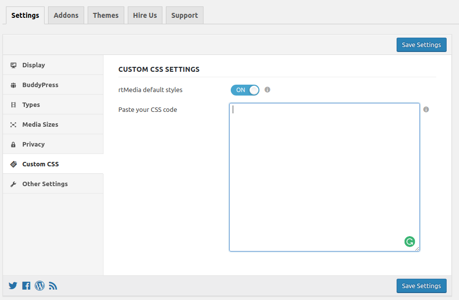
2) Please add following css into rtMedia->Settings->CUSTOM CSS
@media only screen and (max-width: 640px) {
    body .mfp-container {
        max-width: 100%;
    }
}
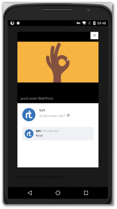
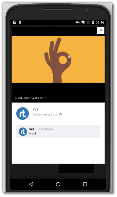
You can see the difference in below screenshots.
You must be logged in to post a comment.